Thursday, 21 May 2015
Thursday, 14 May 2015
Logos Research - The History Behind the Logos
Disney

Disney was established in 1923, Disney did not use a logo for their movies until 1985. Up until then, they simply used some variation of the words Walt Disney Present. The “Magic Castle” logo presented on a plain blue background was used from 1985 up in till 1995, when Toy Story was released. As a resulted from the union of Pixar and Disney the logo was swapped out for something more thematic to the feature it introduced. This can be seen in this YouTube clip https://www.youtube.com/watch?v=noHhkzBmhRE#t=291 .This was the first time that the castle was coloured something other than light blue. In 2006, Disney brought the animation company Pixar. The logo was then updated to a more artful presentation. Soon after, Disney movies began to get their own unique logo animation, and the company choose to change the writing on the logo in 2011 from “Walt Disney Pictures” to just “Disney”. Disney is a very identifiable brand and because of their popularity people know generally the type of movies that they produce. But in saying that their logo dose not specify the genre. This is more individual dependent on the movie self. There is a stranded logo but then that is modified. For example in The Pirates of the Caribbean, the flag on top of the castle was a traditional pirate flag with a skull and two bones crossing.
DreamWorks
DreamWorks was established in 1994 by three founders Steven Spielberg, Jeffrey Katzenberg and David Geffen together they wanted to create a new kind of Hollywood studio. Spielberg always wanted to use the image of a man fishing from the moon. He wanted a logo that reminded others of Hollywood’s golden age. He at first wanted it to be a CGI but instead an artist, Robert Hunt was asked to hand-draw the image. It was Hunt that suggested that the man become a boy and the boy on the moon was modeled after Hunt’s son. To add a personal touch to the logo DreamWorks added the initials SKG to the bottom to stand for the three original founders

When the company grew, it was decided that the logo needed to be updated. They choice to stay with the original logo of the fishing boy, but they decided to update the logo with the use of computer graphics. By doing this it achieved the effect of creating a move modern feel. Furthermore they decide to add clouds to the logo which gave the illusion of depth as well as updating the boy and moon, to created
a more whimsical fell as the moon looks more realistic.
As time has gone on the DreamWorks logo has stayed true to its Original idea. It still shows the image of a young boy fishing from the moon with clouds surrounding him. However the word itself DreamWorks name has changed. Each letter was given a bright colour. Practically it helps to make the logo stand out and be much more visible but on a more symbolic
note, this could be symbolising how each movie that they
produces stands out,they are not like others, they have their
own personal touch to them.
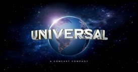
Universal

 Because of the background of Universal the logo has been on a huge journey. I have chosen 2 examples from the possible 12, the very first and the most current. It is understandable after knowing the history of the owner to why there are so many logos
 Because of the share quantity of the variants of the logos I will just focus on the most current. This logo was designed by Weta Digital in New Zealand and is the result of the evolution of over the years. When you see the 1st logo to the most current, the viewers can see a clear progression over time. The word Universal means Omnipresent which is symbolic of how there company is now all over the world. By having the word Universal so bold in front of the world it creates the feeling of dominance. Furthermore it creates the feeling that they have authority over a majority of the world. Another fetcher of this logo is the perspective that it has, it is from space and because of that it adds to the feeling of universal being in control. They can see all from a high angle and because of this hight it adds to the dominance of the logo.
Summery of logos
After looking at all of these logos there are similarities seen in them. For example they all have their brand names very bold and visible on the logo. Furthermore the ones that i have research specifically all have very bold and permeant landmarks/backgrounds. For example the moon and the earth are permeant they are not going to change the moon has been in the sky since creation, as the earth and stars has. This helps to create the feeling of stability within the logo, as if they will not change. This also apples to the Magical Castle, even though it has not been their for all of time so far it still gives a sense of stability and strength.
Subscribe to:
Comments (Atom)